Herbalife Icon System
Group Design Director: Zulema Orozco
Associate Design Director: Alice Xiao
Designer: Elizabeth Stakofsky
Herbalife brings together wellness, community, and business, which means their digital ecosystem has a lot of moving parts. On one side are the sub-brands, programs that are more community-facing and focused on wellness. On the other is HL360, the core platform distributors use to manage and grow their business.
This project focused on creating a flexible visual system that tied everything together. The challenge was making the sub-brands and HL360 feel like part of the same family while still letting HL360 stand apart as a more focused, professional tool.
My Role
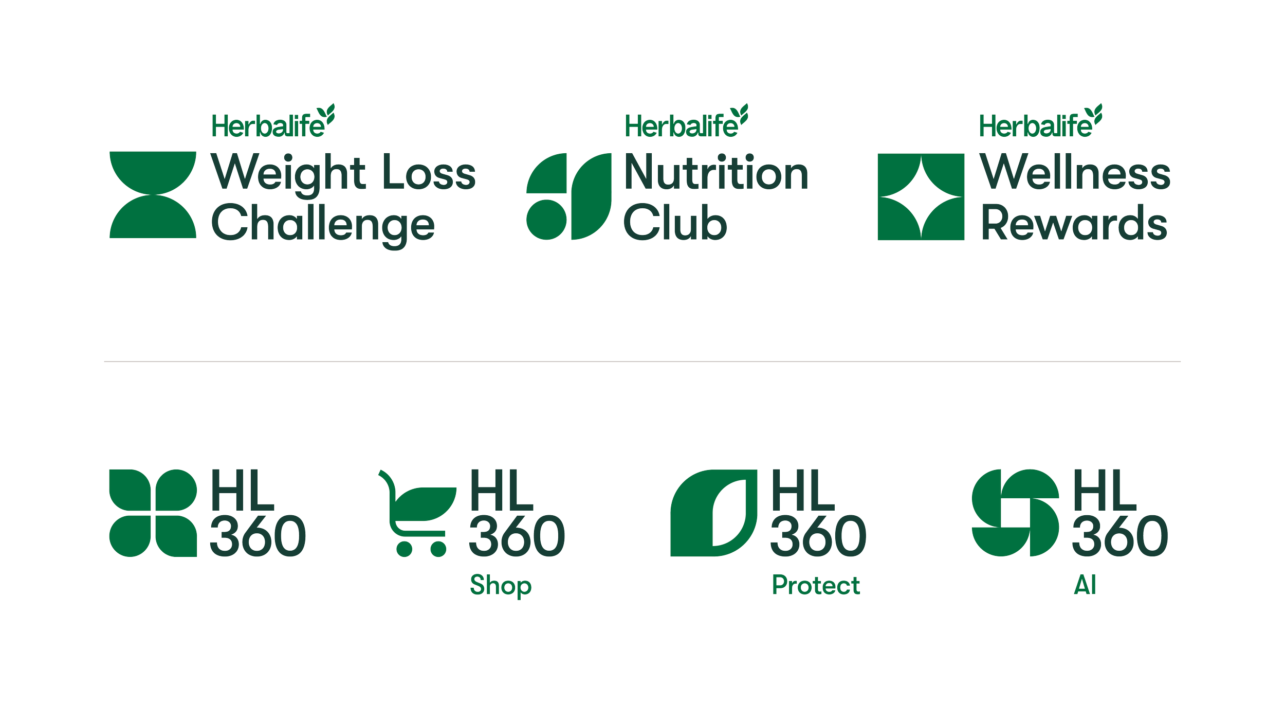
Created a custom icon system for both the sub-brands and HL360, designed to feel cohesive but purpose-built.
Helped shape a geometric design language so every icon felt intentional and rooted in the brand.
Defined how color and typography differentiate community programs from business tools while keeping the system unified.
Building the System
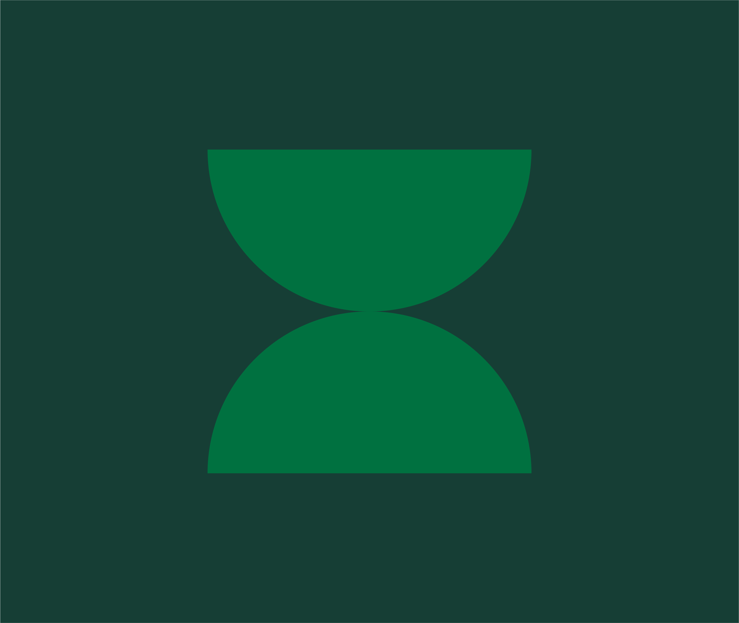
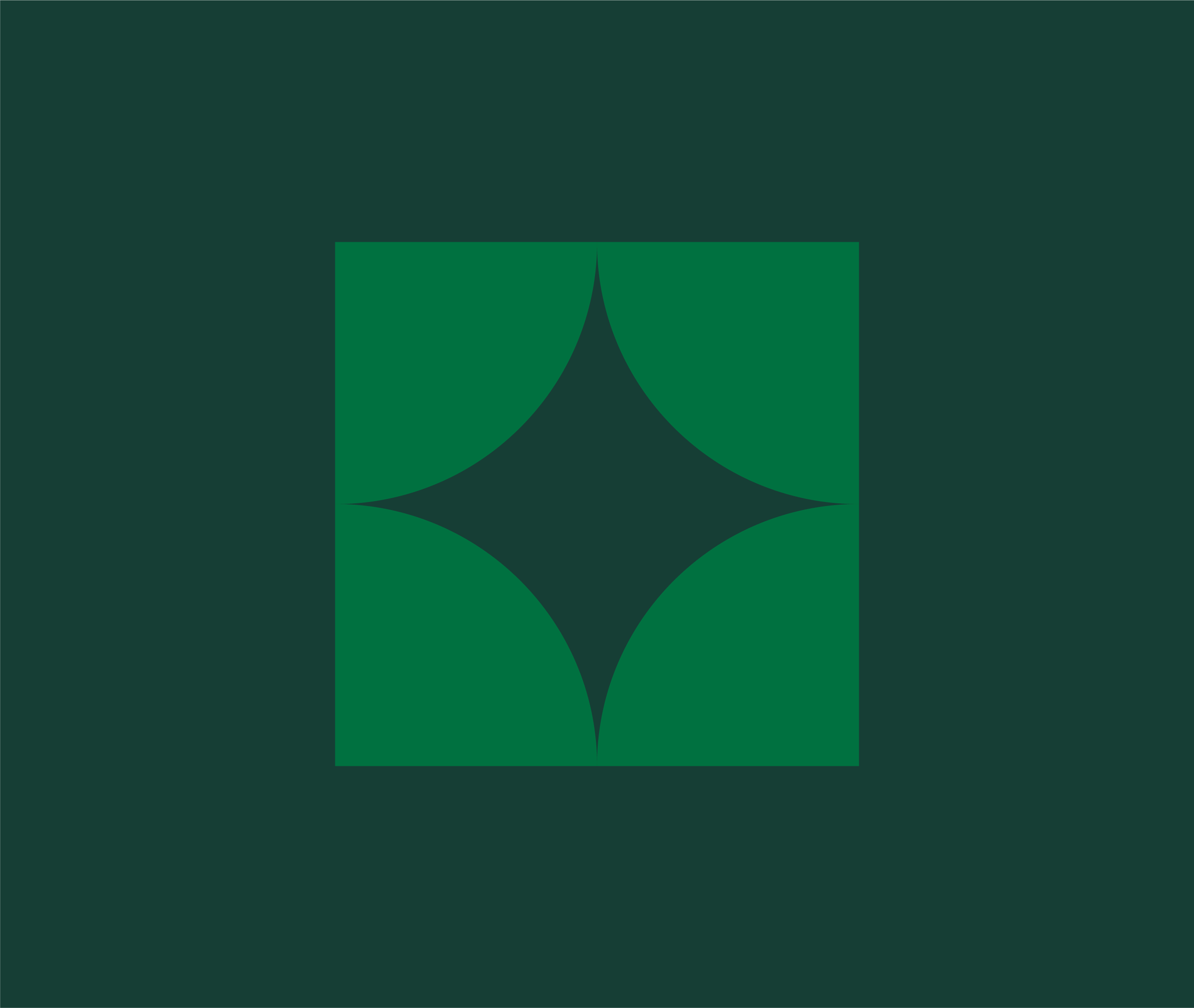
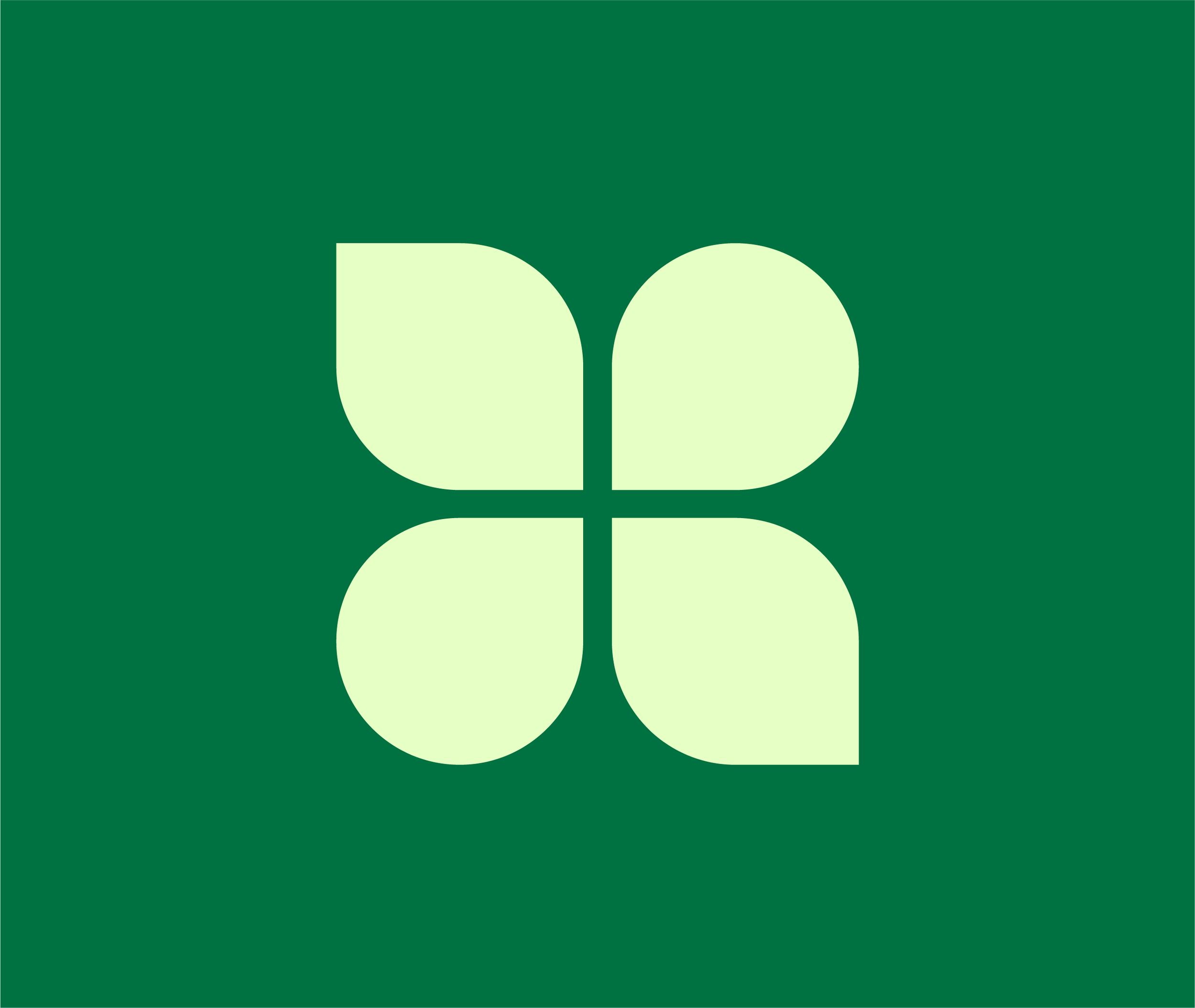
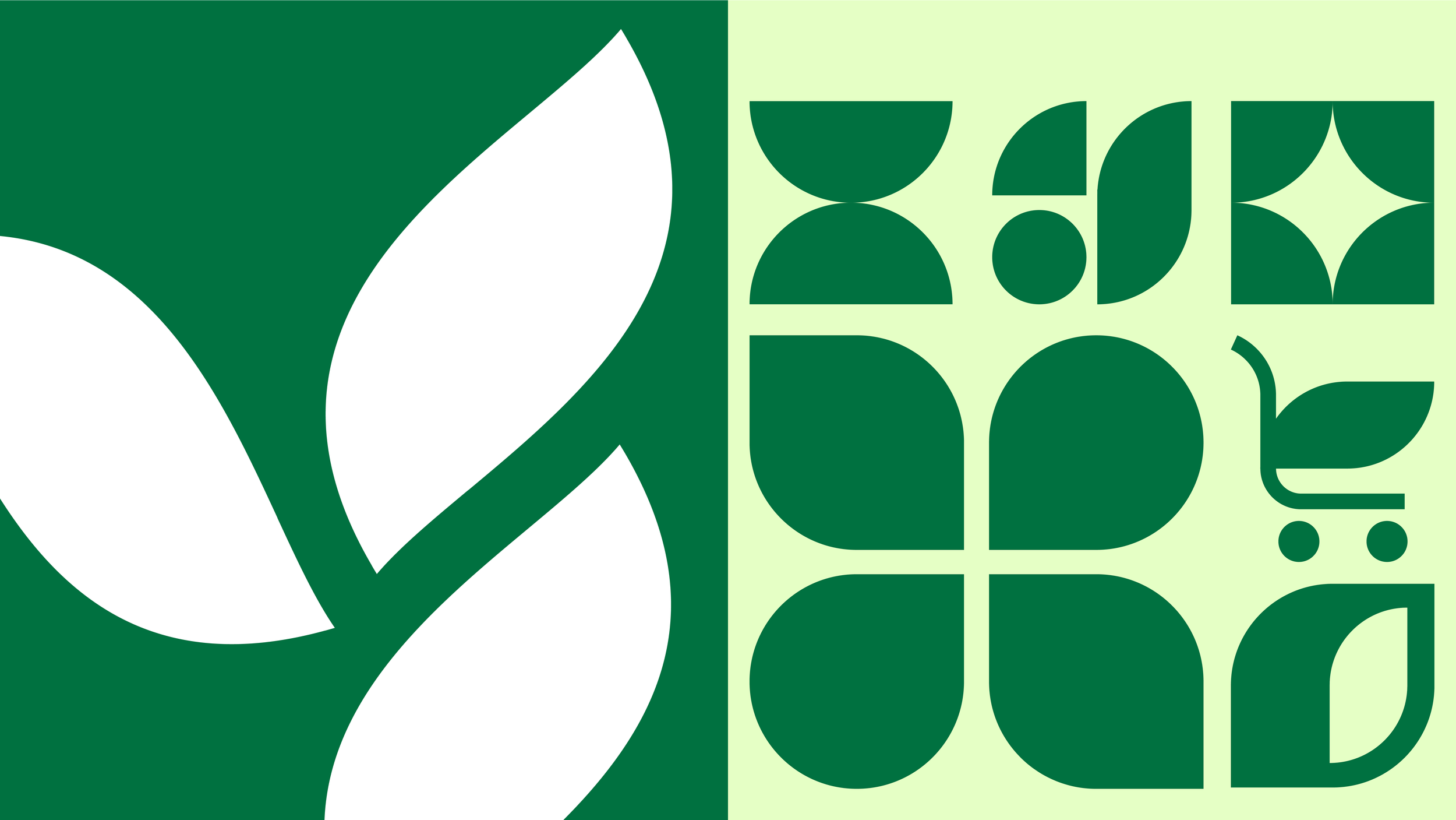
The tri-leaf from the main Herbalife logo became the visual anchor for the system. Its geometry was distilled into angles, curves, and arcs, forming a flexible shape language that scales across the ecosystem. The result feels modern yet organic, balancing business functionality with a focus on health and wellness.
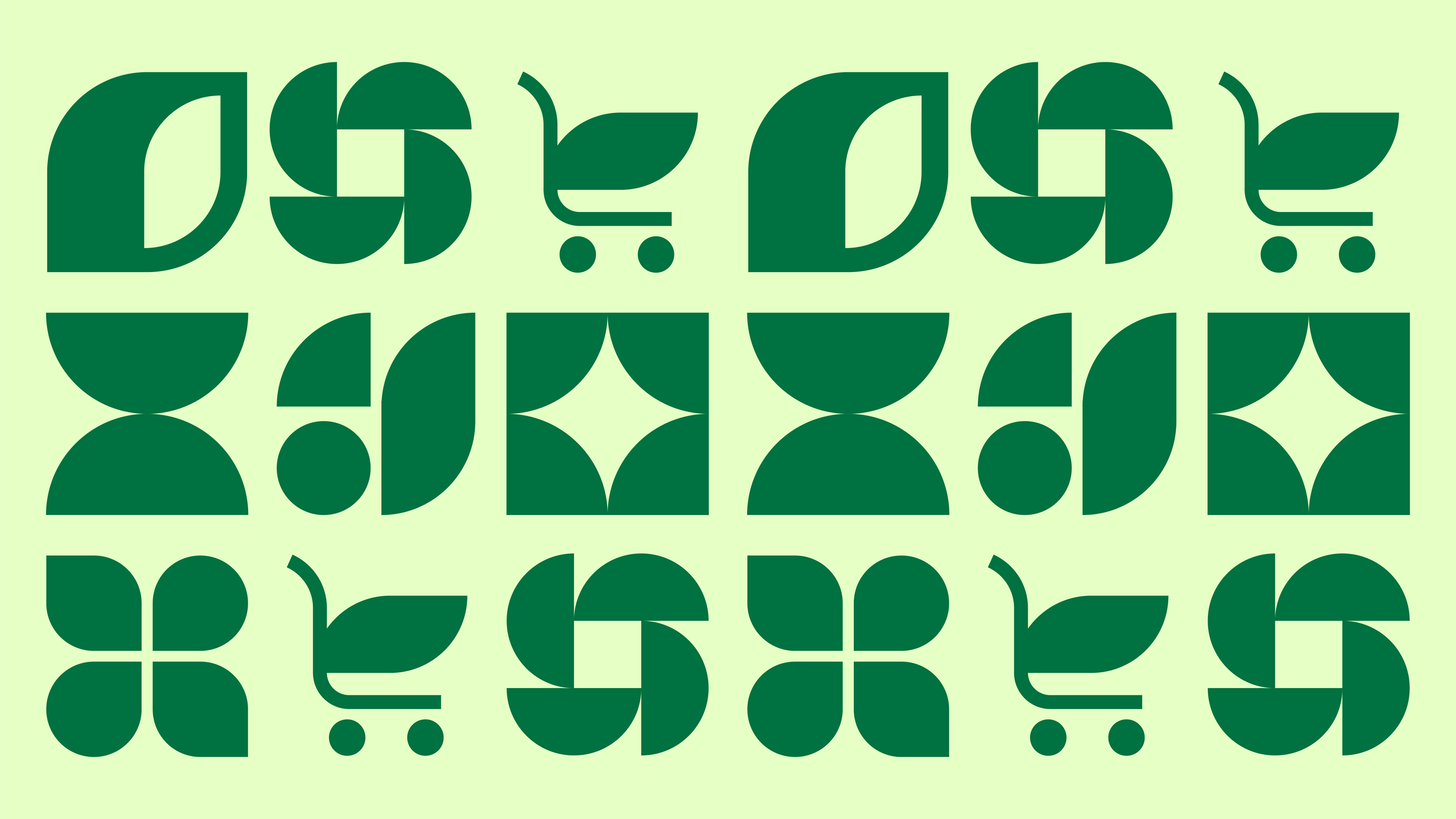
The Icons
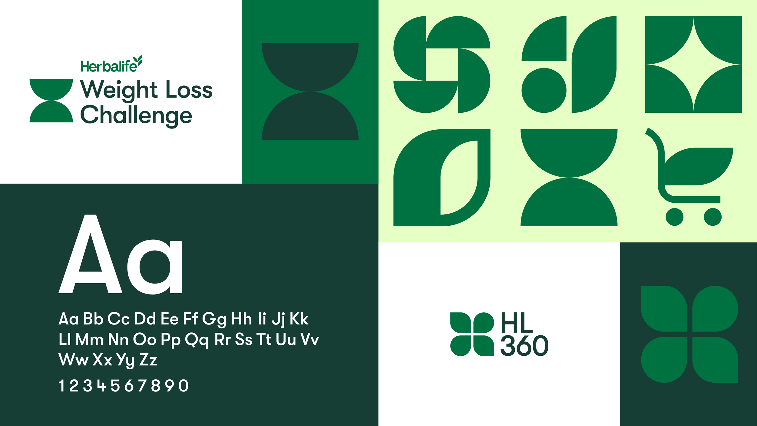
Every icon is built at the same weight and follows the same visual rules, keeping the system consistent. The differences come from shape, all derived from the tri-leaf, which allows each icon to represent a different idea while still feeling part of the same family.
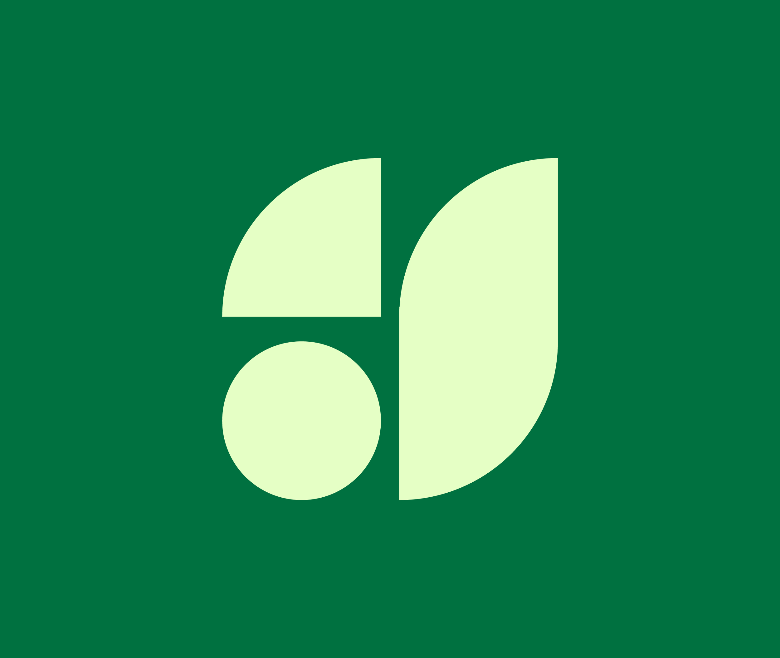
The Structure
The structure of the icons is pulled straight from the Herbalife logo, using its proportions and spacing as a reference. That attention to detail helps everything feel consistent, even across very different icons.

The Lockups
Lockups use a geometric typeface that complements the icon style, with consistent typography across consumer programs and HL360 to keep the system unified. Forest green adds a more premium feel, while garden green reinforces consistency across the broader brand.
The Result
The system is designed to scale across Herbalife’s ecosystem, creating clarity between community programs and business tools while keeping everything visually connected.